[ad_1]
Wouldn’t it be great if instead of having to spend all that time making your own educational content, you could get an AI to do it for you? That’s the general thesis behind Learn.xyz, and it helped the company close $3 million. Parts of the pitch make it really easy to see why it was successful in closing the round, and other parts . . . well, we’ll get to that.
We’re looking for more unique pitch decks to tear down, so if you want to submit your own, here’s how you can do that.
Slides in this deck
Learn.xyz has a fun and lightly animated deck that I can’t capture in screenshots (boo!), but I’ll link to the full pitch deck at the end.
Here is the full, 10-slide deck the company used to pitch its company, closing its $3 million seed round:
- Cover slide
- Team slide
- Vision slide
- Problem slide
- Solution slide
- Product demo slide
- Traction slide
- Why Now slide
- Revenue model slide
- The Ask slide
Three things to love
I love the bold brevity of a 10-slide deck, but regular readers of this column are already mentally preparing for the inevitable tongue-lashing (finger lashing?) for all the info that’s missing. Nevertheless, there’s a lot of great content here.
Joyful design
When the founder told me that the company’s pitch deck is animated, thus rendering a PDF version useless, I was ready to go on a tirade about there being no place for animations in pitch decks. But I was dead wrong. The deck works without the animations, but Learn.xyz was able to strike a great balance that adds to the whole experience. Overall, the company’s design language is strong and simple:
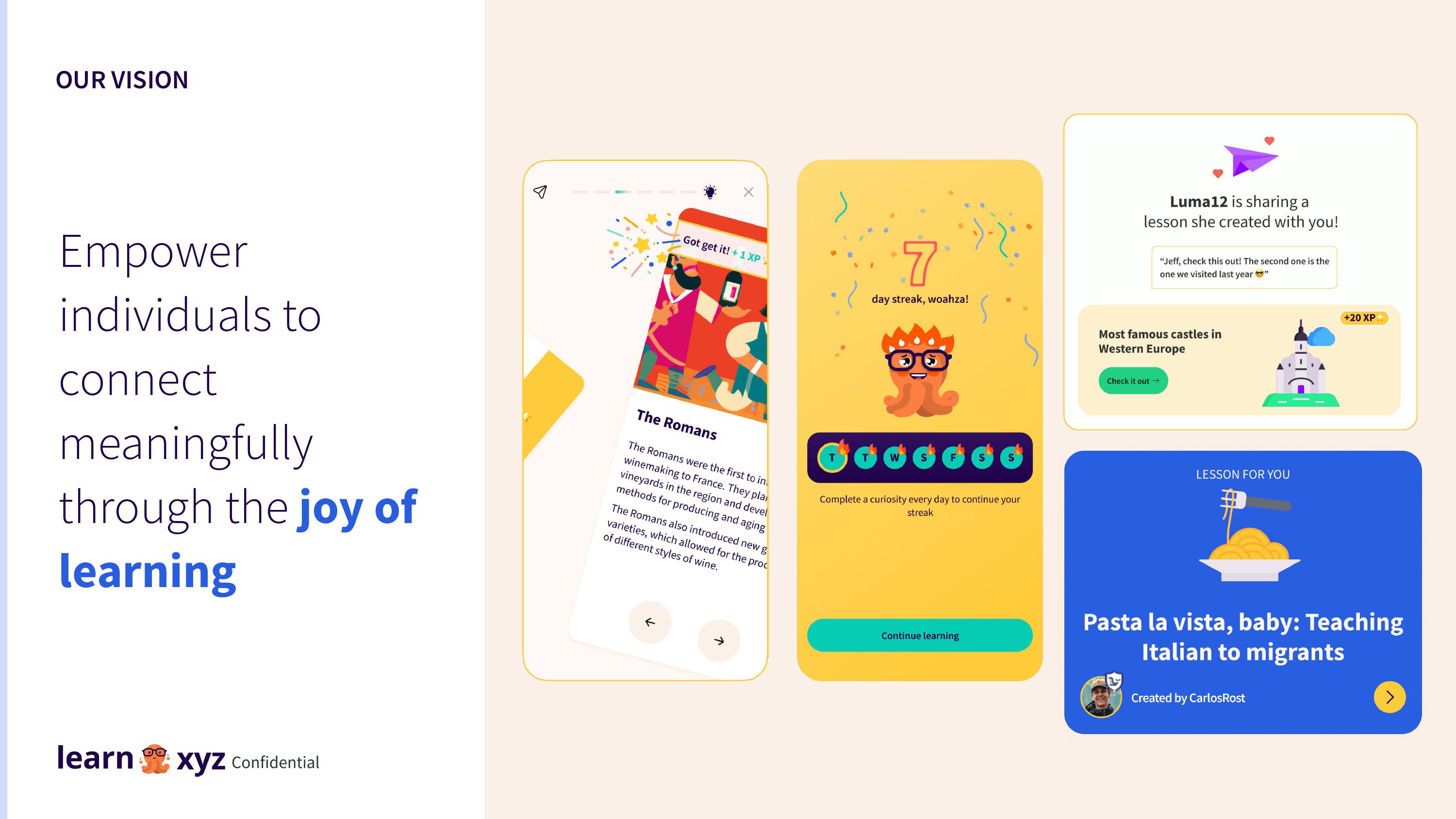
[Slide 3] Fun and lighthearted design. Not too much info on the slides, however. Image Credits: Learn.xyz
The screenshots, the design of the characters, and the use of language all lend themselves to the company’s claim: bringing joy to learning.
Clear problem statement
From my own experience, I know that creating a lesson plan is a royal pain. This slide lays out the problem nicely.
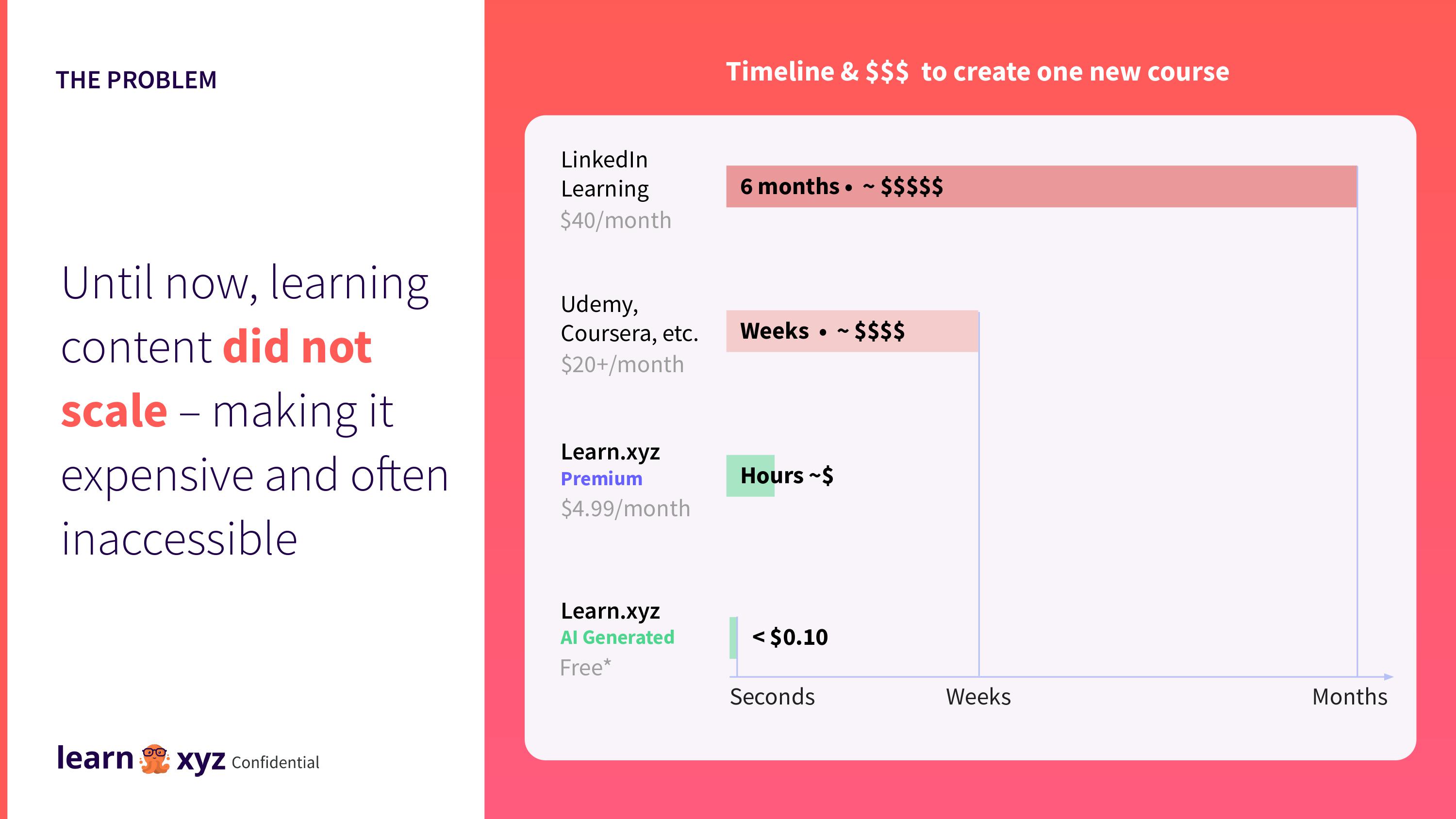
[Slide 4] The problem. Image Credits: Learn.xyz
Creating content doesn’t easily scale, and assuming that the AI-generated robot can generate quality that’s good enough, this would be an enormous leap forward. Very cool indeed.
I would like to very gently, for the record, admonish Learn.xyz for sneaking part of its solution/product into the problem slide, but I’ll let it off the hook; it’s done well and subtly.
That’s a lot of traction, y’all
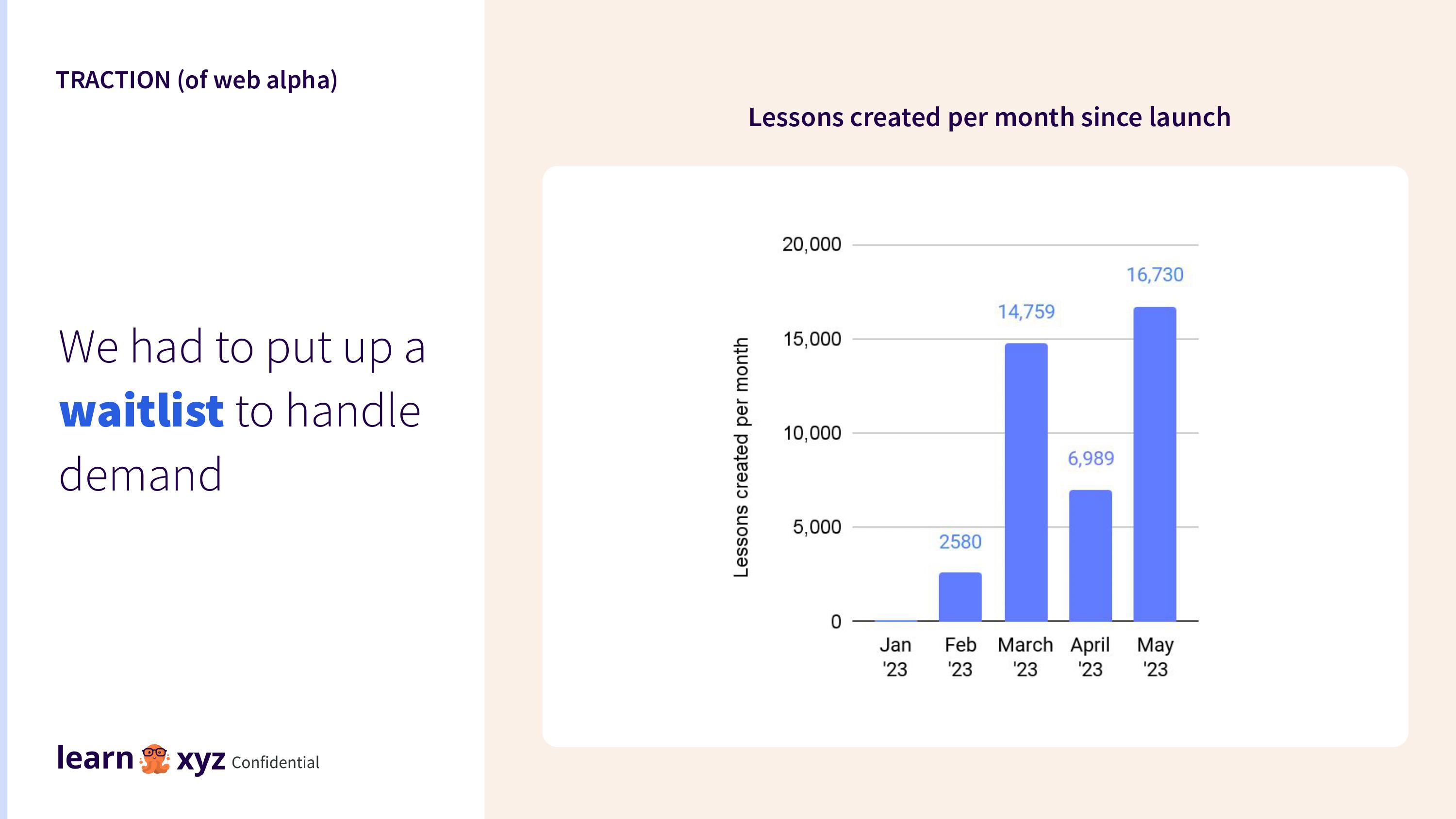
[Slide 7] That’s a lot of traction! Image Credits: Learn.xyz
Getting users to engage with a platform in any way is often a challenge; inviting users to create around 41,000 pieces of content in four short months is beyond impressive.
Of course, there are also some challenges with this graph: What happened in April? Is the number of lessons created really the most important metric for this startup? What about revenue, lessons consumed or customer NPS?
Still, any startup that can get this level of user engagement is worth a closer look, even if both what it is choosing to measure and the measurements themselves are a smidge odd.
In the rest of this teardown, we’ll look at three things Learn.xyz could have improved or done differently, along with its full pitch deck!
[ad_2]
Source link

