[ad_1]

I don’t often tear down angel decks for the Pitch Deck Teardown series for a pretty simple reason: The expectations that angel investors have from a pitch deck are pretty different from what professional institutional investors are looking for. Still, as I was looking through SplitBrick‘s deck, I realized I have some things to say.
For example, there are some major, fundamental problems with this deck that make the company pretty much impossible to invest in. Let’s take a look!
We’re looking for more unique pitch decks to tear down, so if you want to submit your own, here’s how you can do that.
Slides in this deck
SplitBrick submitted an 18-slide, unredacted deck. The slides are:
- Cover slide
- Mission slide
- Business models comparison
- The SplitBrick model
- Market analysis
- Competitive analysis
- How it works
- Management structure
- Traction and journey to date
- Use of funds, the ask, and roadmap
- The team
- Appendix interstitial slide
- Appendix: Screenshots (product walkthrough)
- Appendix: Screenshots (product walkthrough)
- Appendix: Screenshots (product walkthrough)
- Appendix: Screenshots (product walkthrough)
- Appendix: Screenshots (product walkthrough)
- Appendix: Screenshots (product walkthrough)
Three things to love
Sure there was a lot to dislike about this deck, but it’s not all bad, and there are a few points worth highlighting.
Great market context
It’s rare that a startup pitch deck needs to break down a variety of business models in an industry in order to position itself, but innovating on business models is a legitimate way to innovate, so it’s a great thing to include:
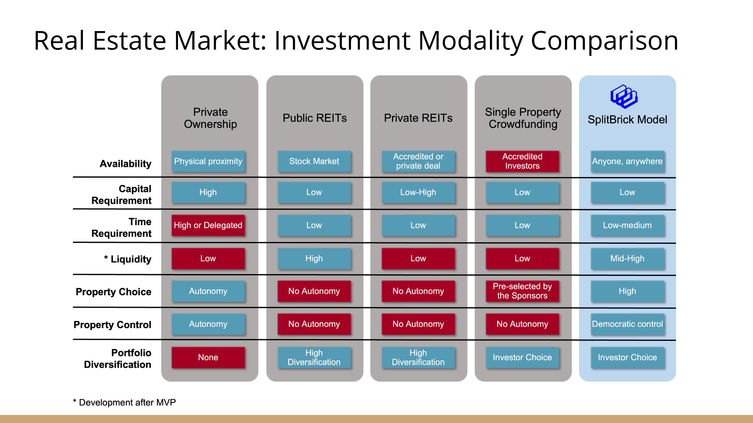
[Slide 3] Breaking out the various business models helps differentiate the startup. Image Credits: SplitBrick
There’s a variety of ways to get a slice of the property action. SplitBrick boldly offers a new alternative and a fresh take on the market.
This is a great example of leading with what makes you unique. There are a lot of challenges with SplitBrick’s specific strategy, but this is exactly where this type of approach shines: Innovate on the aspects of the business that are ripe for disruption, and leave the rest alone.
A clear view of the market
I’d have loved to see some sources here to show where the information is coming from, but if we take the numbers at face value, this slide does a great job of painting a clear picture of a market worth taking a closer look at:

[Slide 5] A clear view of the market opportunity. Image Credits: SplitBrick
An elegant take at a product demo
SplitBrick is a very early-stage company and has therefore only built an MVP. That can be challenging to demo, but the company found an interesting way to do it.

[Slide 15] In the appendix, SplitBrick shows off a user journey that’s easy to follow. Image Credits: SplitBrick
The appendix has six slides that together function as a step-by-step product demo. It shows how the company is thinking about its design language and user journey, which is a really good solution that allows investors to co-dream with the founders.
In the rest of this teardown, we’ll look at three things SplitBrick could have improved or done differently, along with its full pitch deck!
[ad_2]
Source link


